A room can feel expensive before anyone notices the furniture. The secret is often sitting in plain sight: the walls, the surfaces, the edges, and the way every vertical plane carries mood. Good interiors do not happen because someone bought a matching set; they happen because the room has a point of view. That is where Walls And Style become more than decoration, because they decide whether a space feels calm, layered, flat, warm, sharp, or forgettable.
The smartest homes rarely shout. They build interest through proportion, texture, color control, and a few choices that feel personal rather than copied. A bare wall can be peaceful, but a neglected wall feels unfinished. There is a difference. Even small updates, from a deeper paint shade to better art placement, can change how a room behaves. For homeowners thinking about design visibility, brand presence, or home-focused publishing, platforms tied to digital home improvement exposure can also help ideas reach the right audience. Still, inside the room itself, the work begins with attention.
Walls And Style Begin With the Room’s Mood
Every strong interior starts with a mood before it starts with materials. Many people choose paint, panels, shelves, or artwork because they like the object in isolation, then wonder why the room feels scattered. A wall is not a blank shopping list. It is the largest emotional surface in the room, and it needs to support how you want the space to feel when you walk in tired, distracted, excited, or quiet.
Choosing wall colors that change how interiors feel
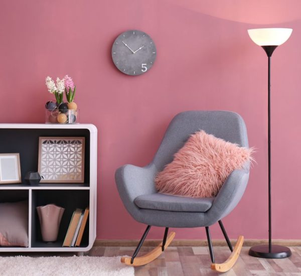
Color carries weight before furniture gets a chance to speak. A soft clay shade can make a dining room feel grounded, while a pale warm white can help a small bedroom breathe. Cool gray, once treated like a safe answer for everything, often falls flat in homes without strong natural light. The problem is not gray itself; the problem is using it as a decision substitute.
A good wall color should react well to your actual day, not only to a showroom photo. Morning light, evening shadows, lamp color, flooring tone, and window direction all change what paint becomes on the wall. A beige with a pink cast can look cozy at noon and oddly sweet at night. A green with too much blue can feel crisp in summer and cold in winter.
The counterintuitive move is to test darker colors in small rooms instead of avoiding them. A tiny study painted in a deep olive or tobacco shade can feel richer than the same room painted white and left visually weak. Small spaces do not always need to look larger. Sometimes they need to feel intentional.
Using accent walls without making rooms look dated
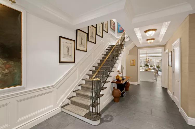
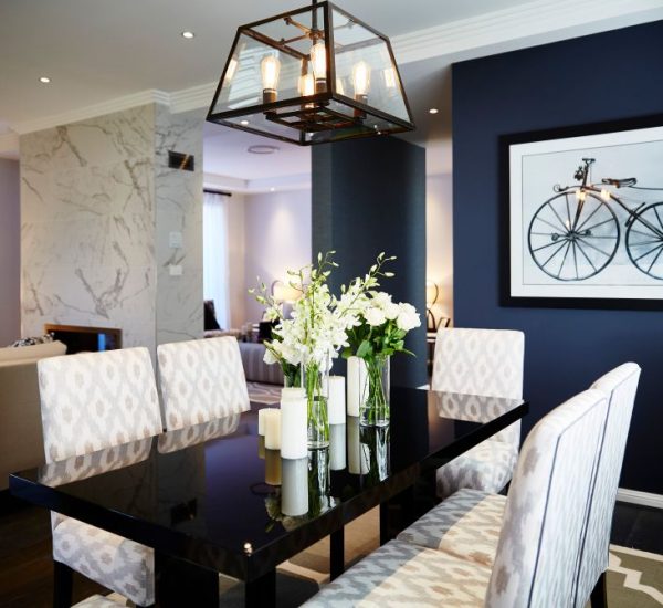
Accent walls fail when they look like someone got nervous halfway through a design choice. One painted wall behind a sofa can work, but only when it has a clear reason. It may frame a fireplace, deepen a headboard zone, or create a visual stop at the end of a hallway. Without that purpose, it becomes a patch.
Wallpaper, limewash, wood slats, and plaster effects can make accent walls feel grown-up again. The trick is restraint. A textured wall behind a bed can give the room depth, while the same finish on every surface may feel heavy and theatrical. Rooms need contrast, not constant drama.
A better test is simple: would the accent wall still make sense if the furniture moved? If the answer is no, the wall may be serving the arrangement, not the architecture. Strong interior wall design respects both, but architecture deserves the first vote.
Texture Makes Interior Walls Feel Designed
Flat rooms usually have flat walls. That does not mean every home needs stone, paneling, or expensive plaster, but it does mean the eye needs something to read. Texture gives a room memory. It creates tiny shadows, soft movement, and a sense that the space has been considered rather than filled.
Wall texture ideas for homes with plain surfaces
Texture does not need to be loud. A limewash finish in a sitting room can add cloudy movement without turning the wall into a feature piece. Grasscloth in a powder room brings a tailored feeling that paint cannot copy. Even simple picture-frame molding can rescue a long blank hallway from feeling like a pass-through zone.
The key is matching texture to the room’s job. Bedrooms like softer surfaces because rest needs visual quiet. Entryways can handle stronger texture because people pass through them quickly. Living rooms sit somewhere in the middle, needing interest without visual noise. A textured wall that looks beautiful online may become tiring if you face it every evening.
Budget does not have to kill the idea. Painted beadboard, fabric panels, framed textile pieces, or matte clay-look paint can bring depth without a full remodel. The best wall texture ideas often come from working with the room’s limits instead of fighting them.
Why smooth walls still need visual depth
Smooth walls can look refined, but only when the rest of the room gives them support. A crisp white wall with weak lighting, small art, and thin curtains does not read as minimal. It reads as unfinished. Minimalism needs stronger decisions than maximalism because there are fewer places to hide.
Lighting plays a major role here. A wall washer, shaded lamp, or picture light can turn a simple surface into part of the room’s atmosphere. Even the shadow from a tall plant can create motion across a plain wall. A smooth wall does not need decoration everywhere, but it needs some relationship with light.
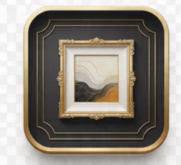
Scale matters too. One large artwork often beats six timid pieces. A wide mirror can stretch a dining room, while a narrow mirror placed too high can make the wall feel awkward. Empty space works only when the filled space has enough confidence to hold it.
Art, Shelving, and Decor Need Discipline
Once walls have color and texture, the next mistake is usually overcorrection. People see open space and rush to fill it. Then the room loses its breath. Wall decor should not behave like storage for every frame, souvenir, shelf, and sign you own. It should edit your personality into something the room can carry.
How to style wall decor without clutter
Wall decor looks best when it has hierarchy. One piece should lead, and the supporting pieces should know their place. A living room with a strong painting above the sofa may need nothing more than a slim side lamp and one sculptural object nearby. Add floating shelves, a gallery wall, a clock, and three plants, and suddenly nothing matters.
Gallery walls can still work, but they need discipline. Keep the spacing tight, the frame tones related, or the subject matter connected. A mix of family photos, sketches, travel prints, and small paintings can look personal when arranged with control. Without control, it feels like a wall got used as a drawer.
The most common error is hanging art too high. Art should relate to people, not ceilings. In most rooms, the center of a piece belongs near eye level, and art above furniture should sit close enough to feel connected. A lonely frame floating far above a sofa makes the whole wall look anxious.
Built-in shelves, niches, and display walls
Shelving changes a wall from surface to structure. That is both its strength and its risk. Built-ins around a fireplace can make a living room feel settled, while random floating shelves can make the same room feel busy. The difference is usually proportion, not price.
A good display shelf needs empty space as much as objects. Books, ceramics, framed photos, baskets, and small lamps should vary in height and density. Stack a few books horizontally, stand others vertically, then leave one area quiet. The eye needs rest between moments of interest.
Niches deserve special care because they already announce themselves. Do not fill every niche with tiny objects. One vessel, one framed piece, or one textured panel can look stronger than a cluster of small decor. A niche is not a cabinet. Treat it like a pause in the wall, and it will reward you.
Finishing Details Decide Whether Interiors Feel Complete
The final layer is where many rooms either mature or fall apart. Trim, lighting, edges, hardware, and proportions rarely get the same excitement as color or art, yet they control whether a design feels built-in or temporary. Details are quiet, but they are not small.
Trim, molding, and edges that sharpen a room
Trim gives walls a frame, and frames change value. A plain room with good baseboards, clean casing, and thoughtful crown molding can feel more finished than a room full of costly furniture. The wall gains shape, and the eye understands where surfaces begin and end.
Molding should match the character of the home. Heavy traditional trim in a low-ceiling apartment can feel costume-like, while ultra-thin trim in an older house may look underfed. The best choice usually respects the building first, then updates it with cleaner proportions or fresher paint.
Painted trim can also shift the entire mood. White trim creates contrast and neatness, but trim painted the same color as the wall can feel calm and tailored. In a narrow hallway, matching trim and wall color can reduce visual chopping. That choice feels bold, but in practice, it often makes the space quieter.
Interior wall design mistakes that quietly weaken a space
The most damaging wall mistakes are rarely dramatic. They are small choices repeated across a home: art hung too high, curtains mounted too low, paint chosen under store lighting, shelves filled edge to edge, mirrors reflecting clutter, and tiny decor scattered across large surfaces. None ruins a room alone. Together, they drain confidence from it.
Scale fixes more than people think. A large wall needs large thinking, not a collection of small apologies. Use a wider curtain rod, a taller mirror, a bigger art piece, or a pair of lamps with real height. When wall choices match the size of the surface, the room relaxes.
The last mistake is treating walls after furniture. Walls should shape the furniture plan, not wait for leftovers. Once you decide what each wall must do, the room becomes easier to furnish, light, and edit. Walls And Style work best when they lead the design instead of trying to rescue it afterward.
Conclusion
A beautiful interior does not need endless objects, louder colors, or a larger budget. It needs walls that know their role. Paint sets the emotional temperature, texture gives the eye something to hold, decor adds personal rhythm, and finishing details make the whole room feel settled. Skip any one of those layers, and the space may still look nice, but it will not fully land.
The smartest move is to stop asking what you can add and start asking what the wall is already doing. Is it framing rest, creating depth, showing memory, softening light, or giving the room a stronger spine? When you answer that honestly, Walls And Style become practical tools rather than vague design words.
Choose one wall in your home this week and improve it with purpose, not panic. Change the color, lower the art, edit the shelves, add texture, or fix the lighting. One strong wall can teach the rest of the room how to behave.
Frequently Asked Questions
What are the best wall color ideas for small interiors?
Warm whites, soft taupes, muted greens, and clay-based neutrals work well because they add comfort without closing the room in. Darker shades can also succeed in small interiors when used with good lighting and simple furniture.
How can I style wall decor without making a room look crowded?
Choose one main visual focus, then let every other piece support it. Use fewer items at a stronger scale, keep spacing consistent, and leave some open wall area so the room feels designed rather than packed.
What wall texture ideas work best for modern homes?
Limewash, Roman clay, grasscloth, fluted wood, painted paneling, and subtle plaster finishes suit modern homes well. The best choice depends on the room’s light, size, and purpose, not on trend value alone.
How high should artwork be hung on interior walls?
Most artwork looks best when its center sits near eye level. Above furniture, keep the frame close enough to feel connected to the sofa, bed, or console instead of floating near the ceiling.
Are accent walls still stylish for interiors?
Accent walls still work when they frame a clear feature, such as a bed, fireplace, dining area, or hallway end. They look dated when they appear random, overly bright, or disconnected from the room’s architecture.
What is the easiest way to improve plain interior walls?
Better lighting is often the fastest fix. Add a picture light, wall sconce, floor lamp, larger artwork, or textured fabric piece to create depth without repainting or remodeling the entire room.
How do shelves improve interior wall design?
Shelves add structure, storage, and personality when styled with restraint. Mix books, objects, framed pieces, and empty space so the shelf feels collected rather than crowded or overly staged.
What wall design mistakes should homeowners avoid?
Avoid tiny art on large walls, poor paint testing, cluttered gallery layouts, low curtain rods, weak lighting, and shelves packed with small objects. These mistakes make interiors feel unfinished even when the furniture is good.