A room can look expensive and still feel wrong. You notice it the second you walk in: the sofa is fine, the lighting works, the floor is clean, yet the space feels unfinished because the walls are carrying no real intention. A smart walls and style plan changes that without asking you to rebuild the whole house. It gives every room a visible mood, a sense of order, and a reason for each color, frame, shelf, and texture to exist. Most people decorate from the middle of the room outward, then wonder why the result feels scattered. Walls should not be the leftover surface after furniture decisions are done. They are the background, the frame, and sometimes the strongest feature in the home. When you treat them that way, even simple updates begin to feel designed. For homeowners trying to shape a more polished space, strong visual choices matter as much as reliable visibility, which is why a trusted digital presence partner can be useful for home-focused brands and creators sharing design ideas. Good style starts where your eyes land first.
Walls and style decisions begin with the room’s real behavior
A wall does not exist alone. It reacts to daylight, furniture height, walking paths, clutter, flooring, and the way you actually live in the room. That is why copying a photo rarely works. The room in the photo has different windows, different habits, and probably fewer charging cables hiding behind a chair. Better wall decisions begin with observation, not shopping.
Reading light before choosing home wall decor
Light changes everything you place on a wall. A soft beige can turn yellow in afternoon sun, while a deep green may look rich in morning light and muddy after sunset. Before buying paint, art, or shelves, watch the wall through one full day. Notice where shadows collect and where glare hits first.
Home wall decor works best when it respects that pattern. A glossy frame near a bright window may reflect like a mirror and annoy you every evening. A textured textile or matte print in the same spot can absorb light and feel calmer. The object did not become better. It simply met the wall honestly.
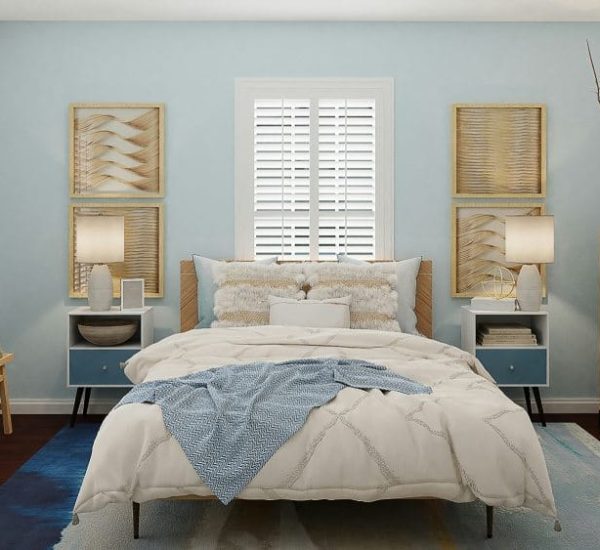
A north-facing room often needs warmth from materials, not only color. Wood frames, woven pieces, clay tones, and fabric panels can keep the space from feeling flat. South-facing rooms can handle cooler tones and bolder contrast because light keeps them alive. The wall is already speaking; your job is to stop interrupting it.
Matching wall color choices to daily use
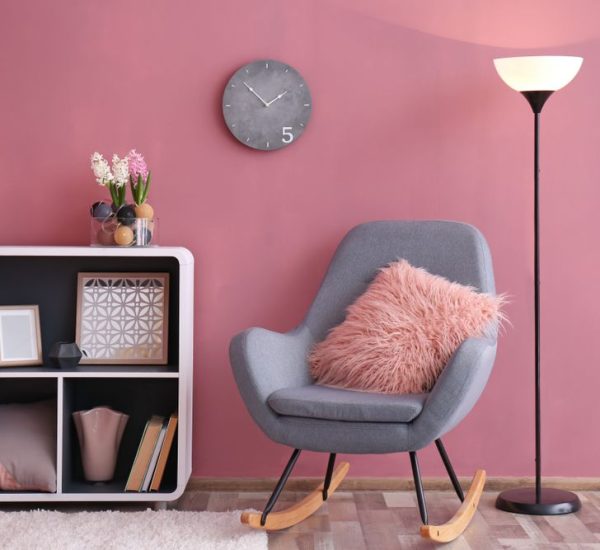
Wall color choices should come after you decide what the room must help you do. A dining room can handle drama because people gather there for defined moments. A bedroom asks for a different kind of control because the wall is the last thing you see at night and the first thing you meet in the morning.
The mistake is choosing color from mood alone. A moody charcoal wall looks sharp online, but it may drain a small work corner where you need focus and alertness. A pale cream may sound safe, yet it can feel dull in a room with weak light and beige flooring. Safe can become tired faster than bold.
Test paint where the eye naturally rests, not behind a door or near the floor. Put samples beside trim, near furniture, and close to the largest window. Live with them for two days. The winning color is not the one that looks best for ten minutes; it is the one that keeps working when the room is messy, quiet, bright, and lived in.
Building depth through interior wall design
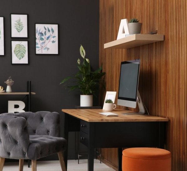
Flat rooms often come from flat thinking. People hang one picture, add one plant, then expect the wall to feel finished. Real depth comes from layers: color, texture, scale, spacing, and negative space all working together. Interior wall design does not mean making every wall busy. It means giving each surface a job.
Using texture without making the room noisy
Texture is the difference between a room that looks decorated and a room that feels held together. Limewash, paneling, grasscloth, plaster effects, fabric art, and ribbed wood can all add depth, but they need restraint. Too many textures in one room start competing like people talking over each other.
Interior wall design becomes stronger when one texture leads and the rest support it. A fluted wood feature behind a bed can carry the room if nearby walls stay quieter. A plaster-style finish in a living room can feel rich when the art remains simple and the furniture lines stay clean. The wall earns attention without begging for it.
Texture also solves a problem paint cannot always fix. In a long hallway, a subtle wall finish can make the space feel less like a passage and more like part of the home. In a small reading corner, a woven hanging can soften sound and make the area feel settled. The best texture is not decoration pasted onto a wall; it is atmosphere with a physical edge.
Letting scale control room styling ideas
Scale is where many room styling ideas fall apart. Tiny art above a large sofa looks timid. Oversized art in a narrow corner can feel like a door you forgot to install. The eye wants proportion before it wants beauty, and it notices imbalance faster than most people admit.
A useful rule is to let the furniture below the wall guide the width of what goes above it. Art over a sofa often feels strongest when it spans a generous portion of the sofa’s width, while a small console may need a taller mirror rather than a wide gallery. The relationship matters more than the object itself.
Room styling ideas also improve when you vary height. A wall with everything hung at the same level feels stiff, even when the pieces are attractive. Mix a vertical mirror, a lower shelf, and one piece of art with breathing room around it. The wall begins to move the eye instead of stopping it in one flat line.
A smarter walls and style guide for personal character
A home loses charm when every choice feels copied from a showroom. Matching sets, safe prints, and predictable color pairings can make a room look acceptable while saying almost nothing about the people inside it. The stronger move is to make the walls personal without turning them into storage for every memory you own.
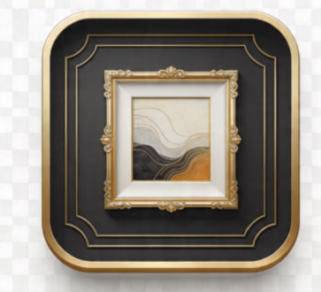
Choosing art that sounds like you
Art does not need to be expensive, but it does need a point of view. A print chosen because it matches the cushions usually feels weaker than a piece that carries a memory, a place, a subject, or even a private joke. Walls become more interesting when they reveal taste instead of obedience.
Personal art works better when you edit hard. One meaningful photograph in a generous frame can carry more weight than twelve small pictures fighting for space. A child’s drawing can look intentional if it is framed with care and placed beside grown-up materials. The context tells the room how seriously to take it.
Home wall decor should not become a scrapbook pasted across every surface. Keep the strongest pieces visible and let the rest rotate seasonally. This gives your walls life without turning them into clutter. A home should remember things, but it should not look trapped by them.
Mixing old and new without visual confusion
Rooms gain soul when they hold more than one time period. A vintage mirror over a clean-lined console can feel sharper than a full set of new pieces. An old landscape painting near modern lighting can create tension in the best way. The room feels collected, not ordered from a single cart.
The trick is to repeat one quiet element across the mix. It might be black frames, warm wood, brass, soft white margins, or a shared color note. That repeated detail acts like a translator between pieces that would otherwise feel unrelated. You can be eclectic without making the wall look accidental.
Wall color choices matter even more when you mix eras. A warm neutral can help older pieces feel grounded, while a deep color can make simple modern frames look more serious. The wall becomes the mediator. Without it, old and new may stand apart like guests who were never introduced.
Styling walls for flow between rooms
A beautiful wall can still fail if it ignores the rest of the house. Rooms do not reset when you cross a doorway. Your eye carries color, shape, and mood from one space into the next, which means wall decisions need rhythm. Not sameness. Rhythm.
Creating connection without copying every room
Connection begins with a limited language. You might repeat soft white trim, black picture frames, warm wood, or muted earth tones across several rooms. Each space can still have its own character, but the repeated details keep the home from feeling chopped into unrelated scenes.
This matters most in open-plan homes, hallways, and small apartments. When every visible wall tells a different story, the whole place feels restless. A calm living area beside a loud dining wall can work, but only if one element links them. Maybe both spaces share similar frame tones or one accent color appears in different strengths.
Interior wall design should guide movement. A hallway can introduce a color that appears more fully in the next room. A landing wall can carry a small gallery that hints at the family room beyond it. These connections are quiet, but they make the home feel intentional instead of assembled piece by piece.
Knowing when blank space is the best design choice
Blank walls scare people. They see empty space and assume something is missing. Often, the missing thing is restraint. A blank wall beside a strong window, a detailed rug, or a built-in shelf may be doing its job by giving the eye somewhere to rest.
Room styling ideas become more mature when you stop filling every surface. Negative space gives important pieces authority. It also makes rooms feel cleaner without removing anything useful. The more visual noise a home carries, the more valuable a quiet wall becomes.
A good test is to remove one wall item for a week. If the room feels calmer and nothing important is lost, the wall was probably overworked. Design is not measured by how much you add. It is measured by how little the room needs once the right choices are in place.
Conclusion
Your walls are not background decoration. They shape how your home feels before anyone notices the sofa, the table, or the rug. A thoughtful wall plan can make a modest room feel settled, personal, and far more expensive than it is. The secret is not buying more. It is choosing with sharper intent.
A strong walls and style approach asks better questions: how does the light behave, what does the room need to support, which pieces deserve attention, and where should the eye rest? Once those answers are clear, paint, art, texture, and spacing become easier decisions. You stop decorating out of panic and start shaping a room with confidence.
Begin with one wall that bothers you every time you enter the room. Study it, edit it, and give it one clear purpose before adding anything new. Change that wall well, and the whole home will start telling a better story.
Frequently Asked Questions
What are the best wall styling ideas for small homes?
Use fewer pieces at a larger scale instead of many small items. Large art, slim vertical mirrors, floating shelves, and soft paint colors can make small homes feel calmer and more open. Keep the floor clear when possible so the walls add height without adding clutter.
How do I choose wall colors for a living room?
Start with the room’s natural light, flooring, and largest furniture pieces. Test paint samples on different walls and check them morning, afternoon, and evening. A good living room color should support daily comfort, flatter the furniture, and still feel pleasant under artificial light.
What home wall decor works best above a sofa?
Large framed art, a wide mirror, a balanced gallery wall, or a textured wall hanging can all work well. The piece should relate to the sofa width and sit low enough to feel connected. Avoid tiny art floating too high because it makes the room feel unfinished.
How can interior wall design make a room feel expensive?
Thoughtful scale, clean spacing, rich texture, and restrained color choices create a higher-end feeling. Expensive-looking rooms rarely depend on price alone. They feel polished because the walls have balance, breathing room, and a clear relationship with the furniture and lighting.
What are easy room styling ideas for renters?
Removable wallpaper, peel-and-stick panels, framed prints, leaning mirrors, fabric hangings, and picture ledges are renter-friendly choices. Focus on pieces you can take with you. A strong layout and consistent color palette can make temporary decor feel intentional and grown-up.
How many walls in a room should be decorated?
Most rooms do not need every wall decorated. One strong feature wall, one supporting wall, and one quieter surface often create better balance. The right number depends on furniture, windows, and room size, but restraint usually looks more confident than filling every blank area.
What wall decor mistakes make a home look cluttered?
Crowding frames, hanging art too high, mixing too many styles, and ignoring scale can make walls feel messy. Another common mistake is decorating every empty space. A room needs visual pauses, so leave some walls calm when other parts of the room already carry detail.
How often should I update wall decor at home?
Review wall decor once or twice a year instead of changing it constantly. Seasonal swaps, new frames, or a fresh paint color can renew a room without waste. Keep meaningful pieces longer, but remove anything that no longer fits the mood or function of the space.